Around The Riverbend
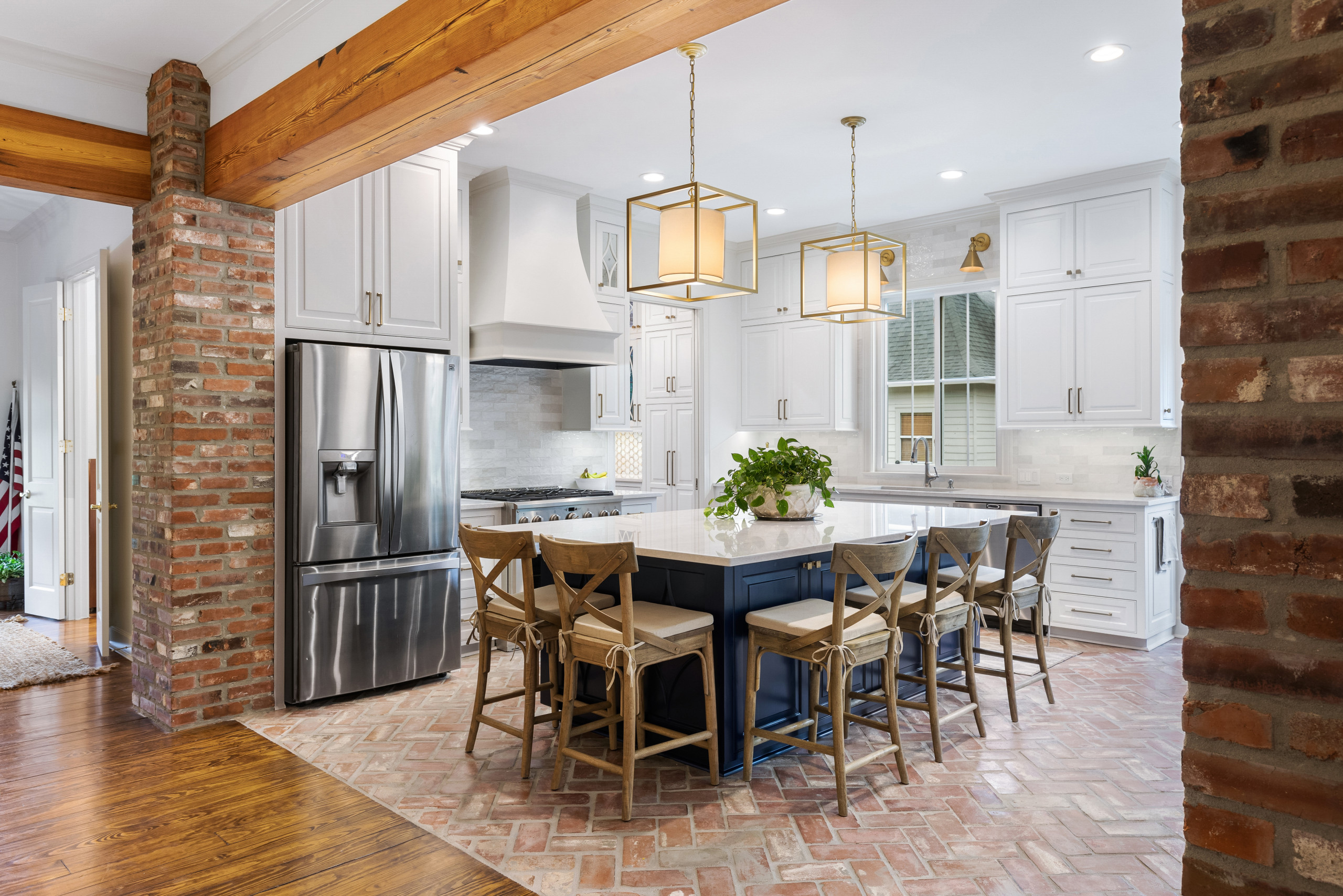
Back in May 2021, we featured this project in a blog post called Real Renders where we showcased a few projects at the completion of the design process but construction was not yet completed. We are so excited to finally share the completed project.
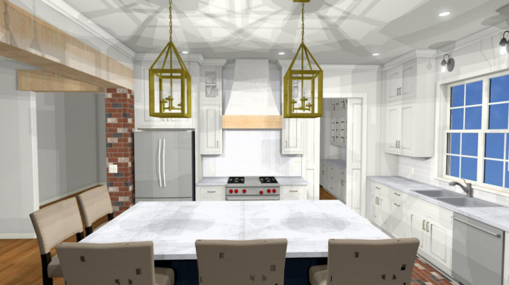
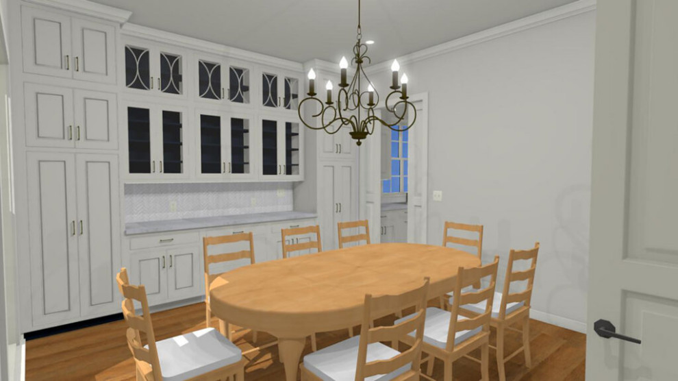
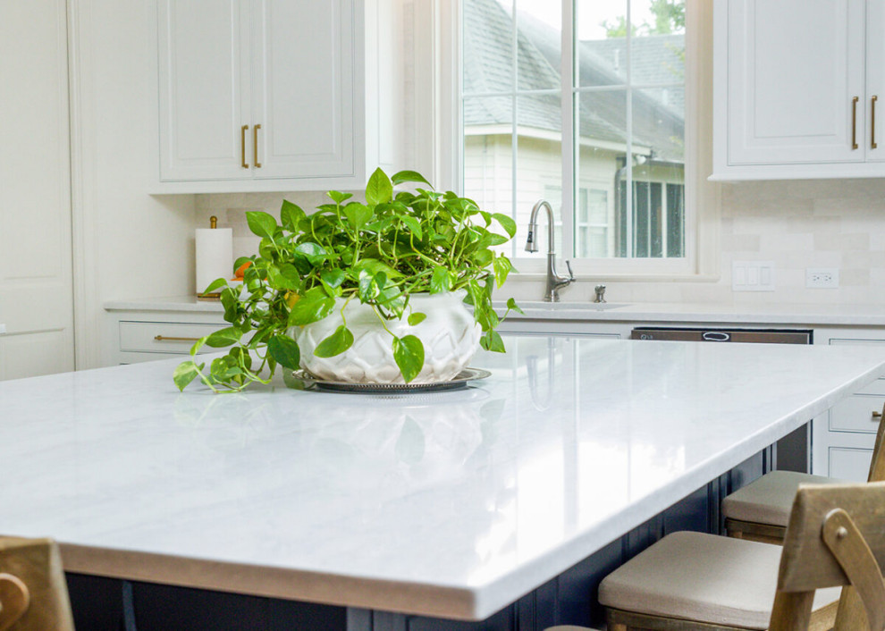
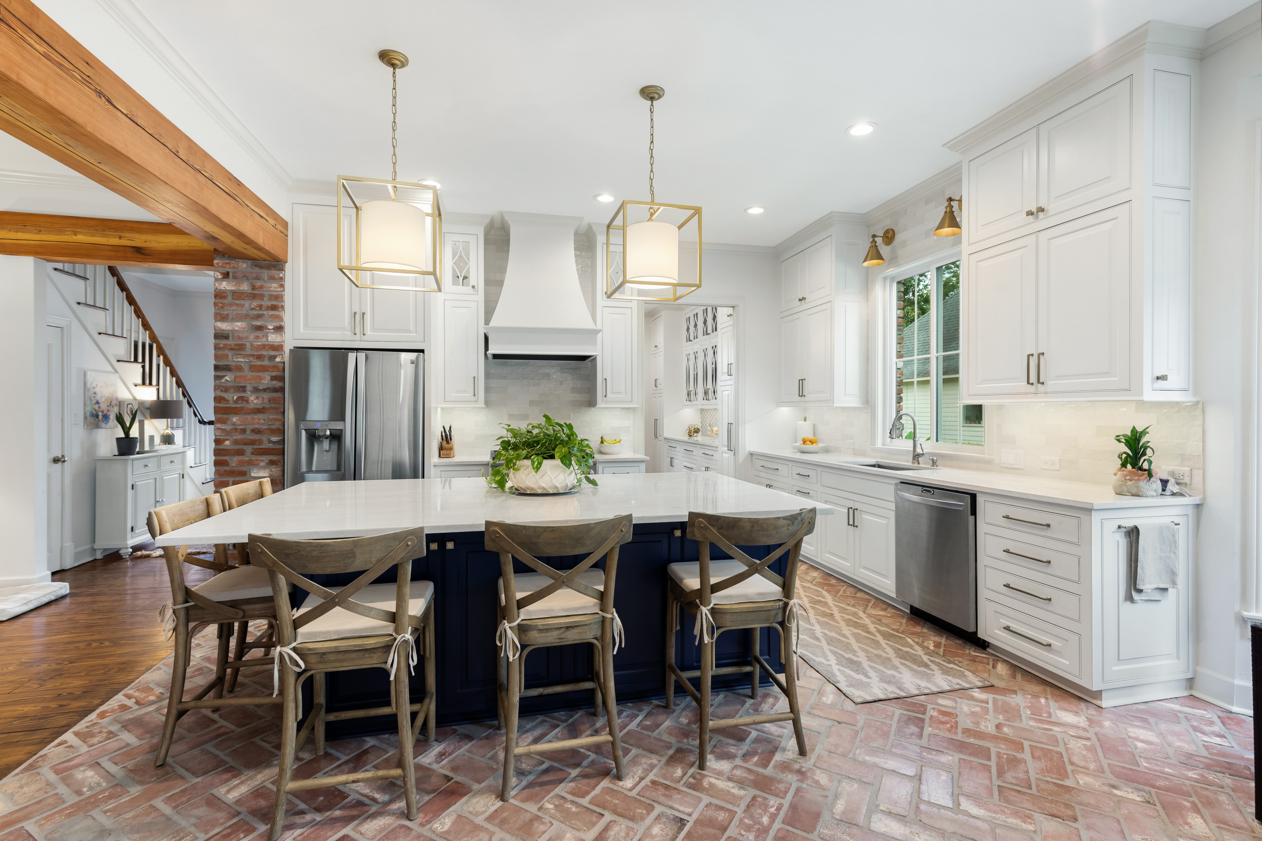
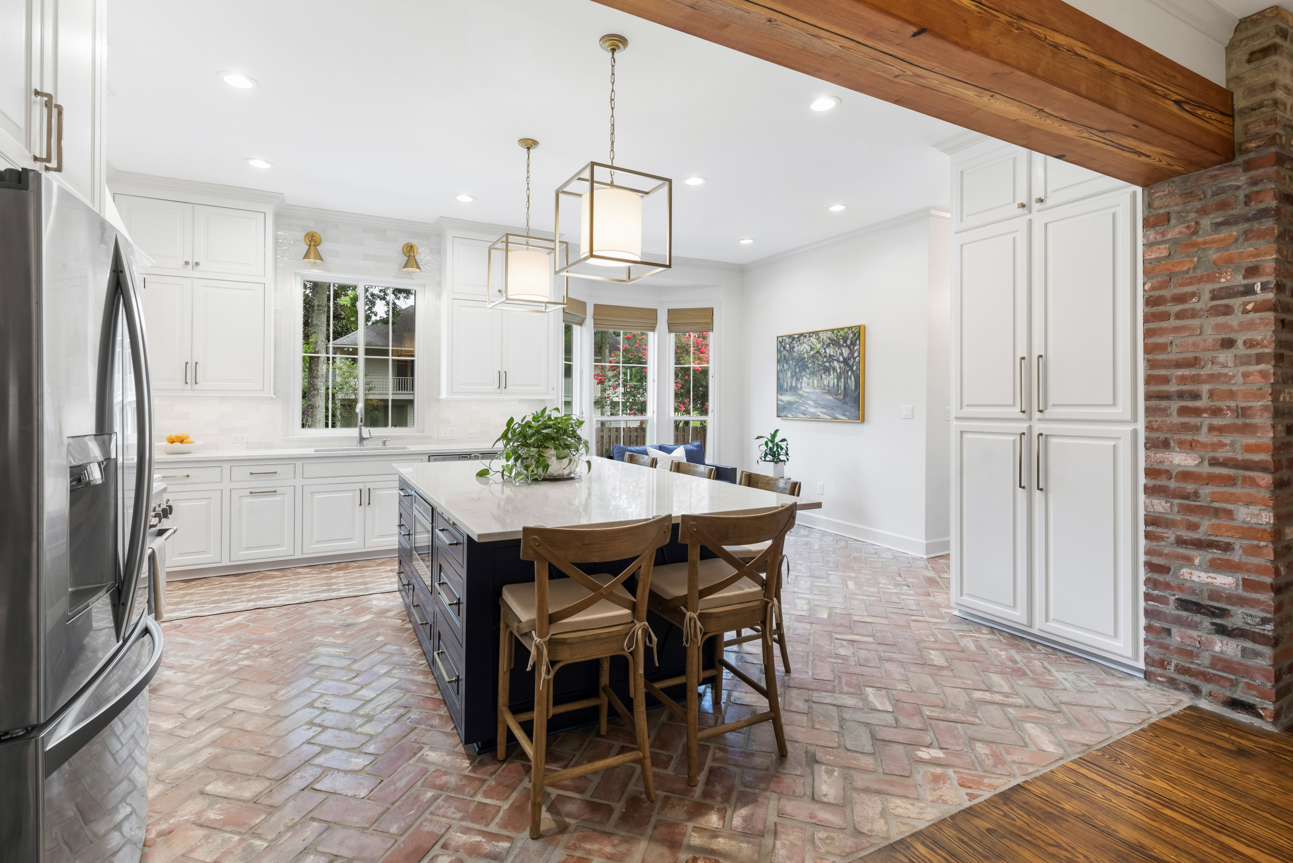
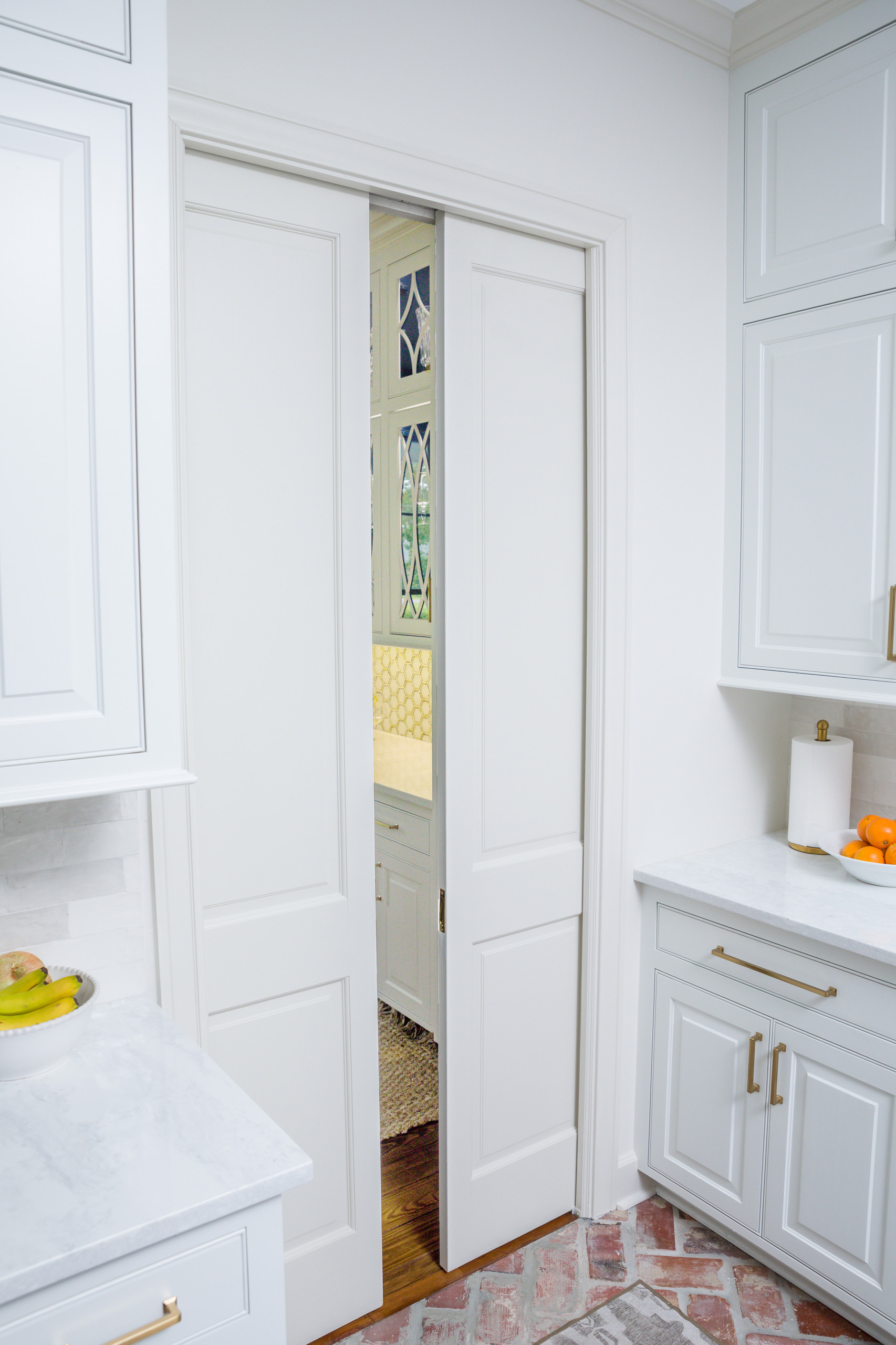
These clients came to us for help with remodeling their kitchen which was not big enough to accommodate a decent size island. The adjacent dining room was very large so we moved the wall separating the kitchen and the dining back by two feet, giving us the extra room we needed for a nice size island in the kitchen while still leaving plenty of dining space.
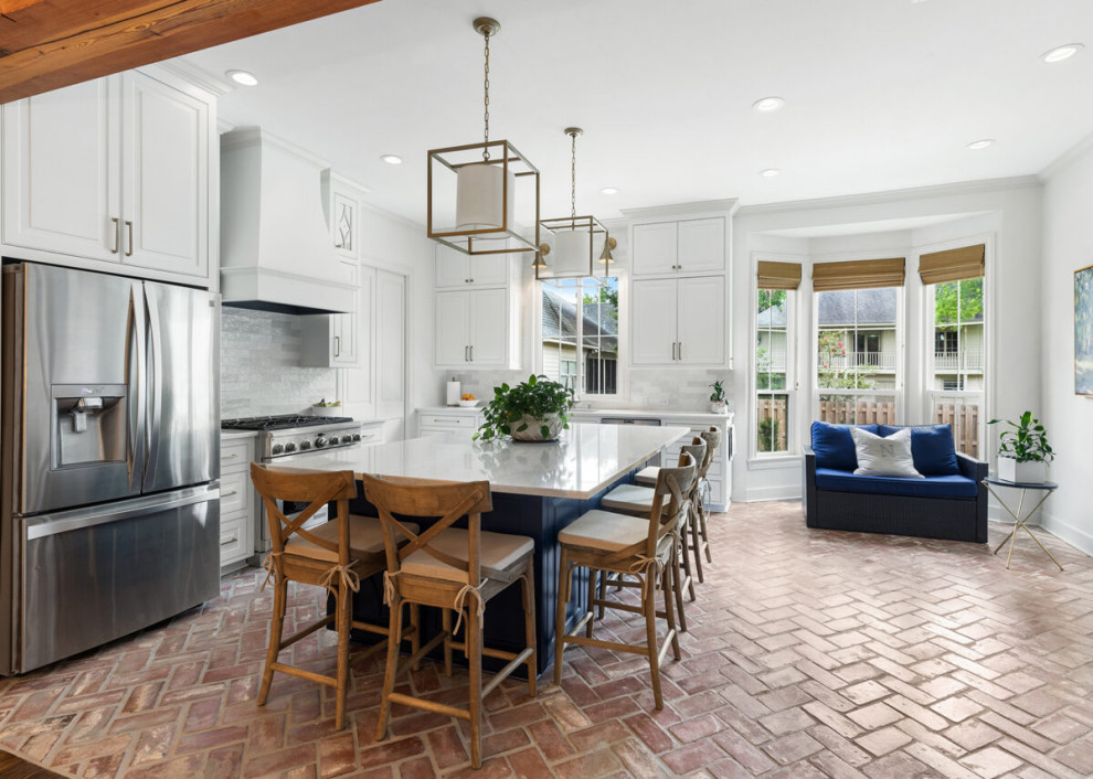
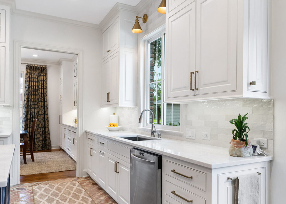
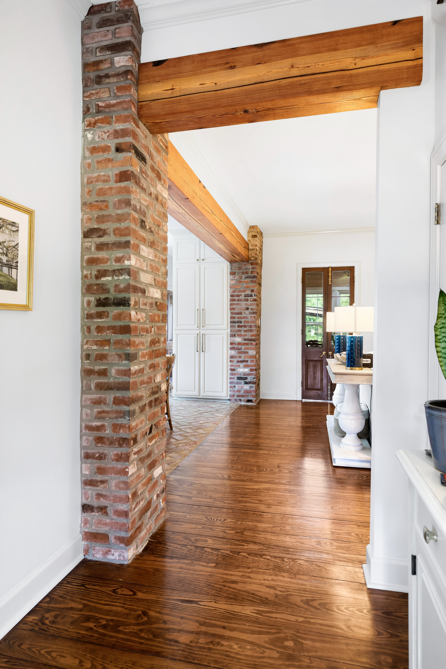
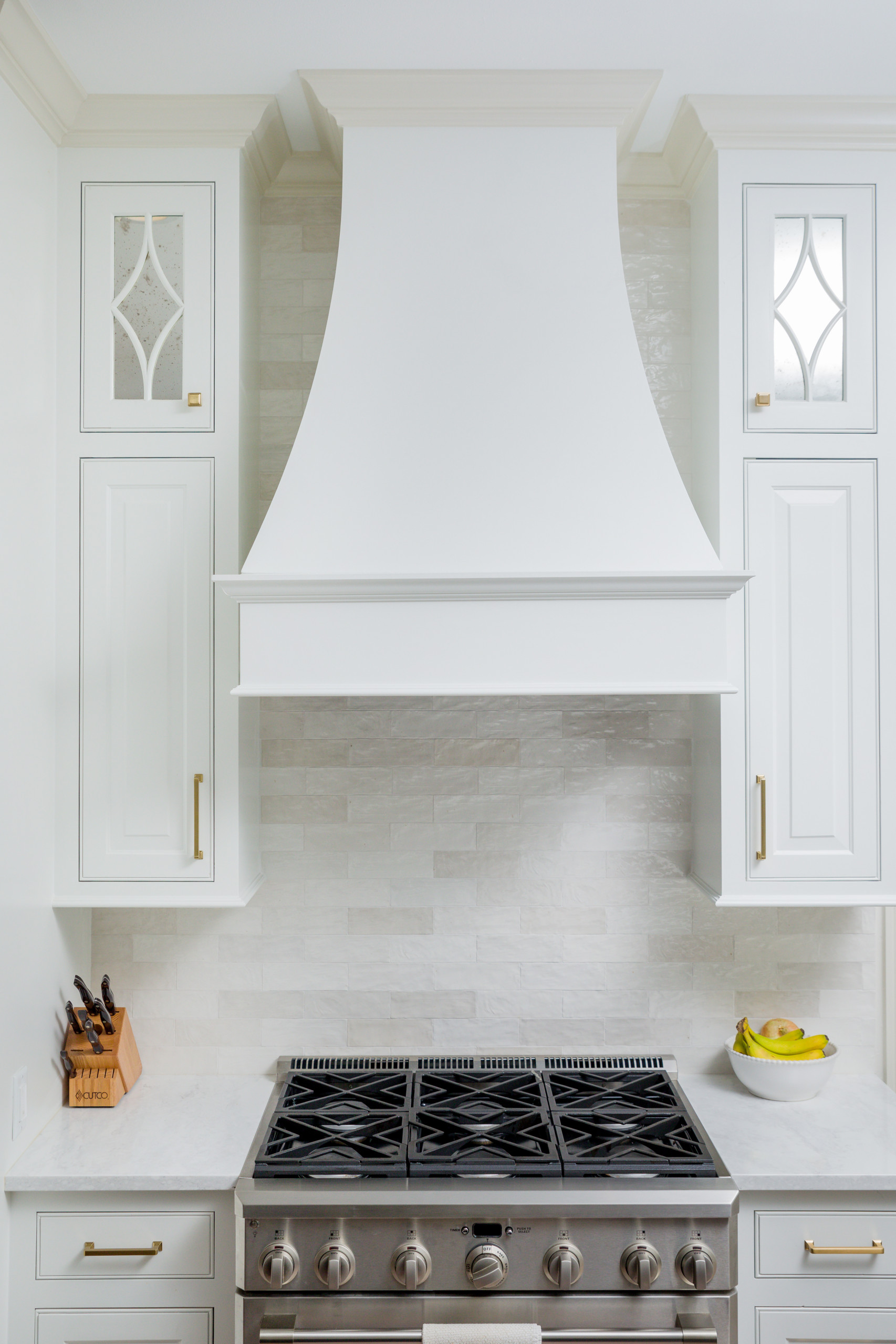
We expanded the window over the kitchen sink to bring in more daylight. We removed the wall between the kitchen and living and framed the opening with brick columns and a wood beam from The Olde Mill. The kitchen layout is an L-shape with the range and sink on separate walls and the island in the center.
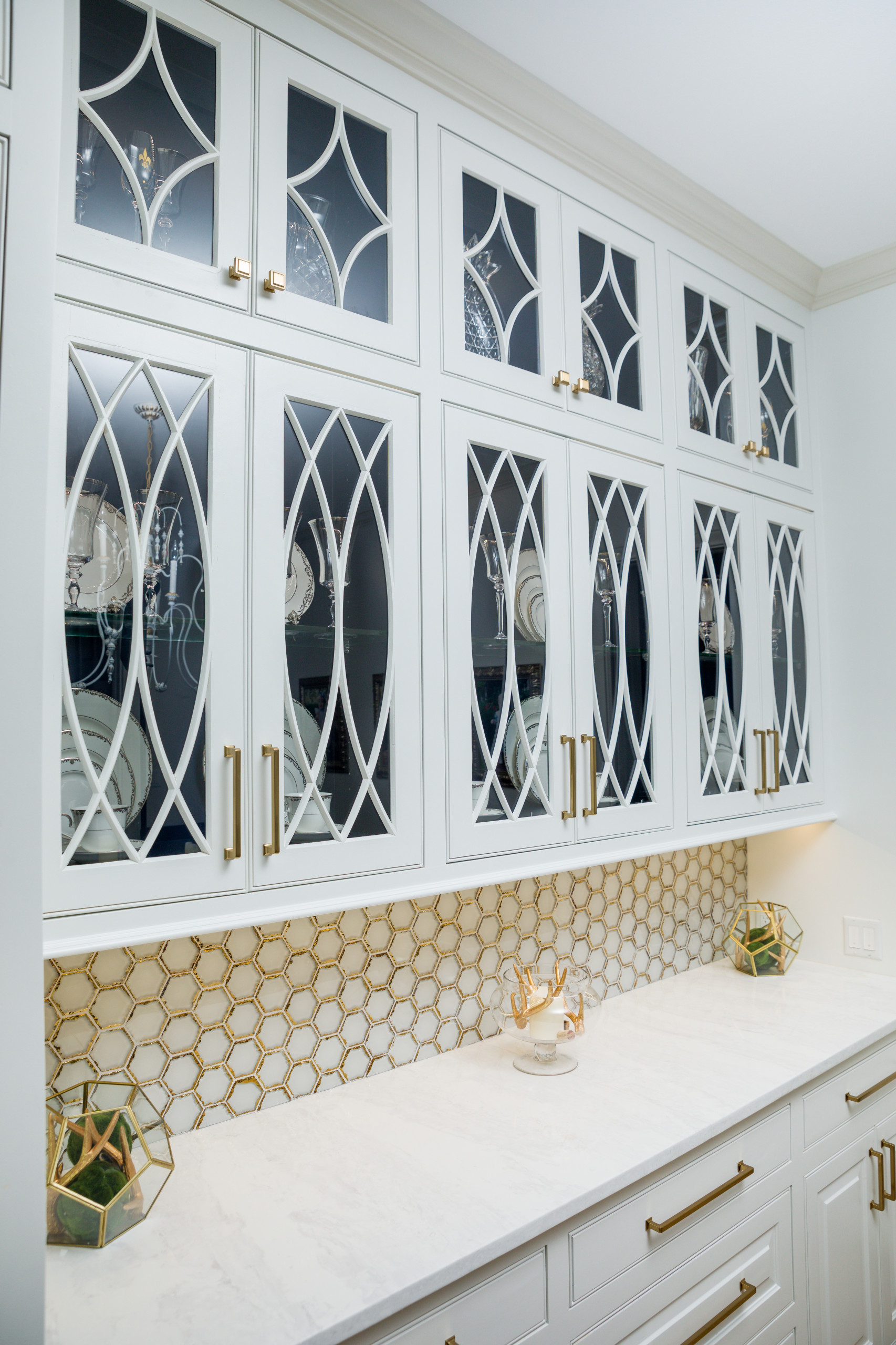
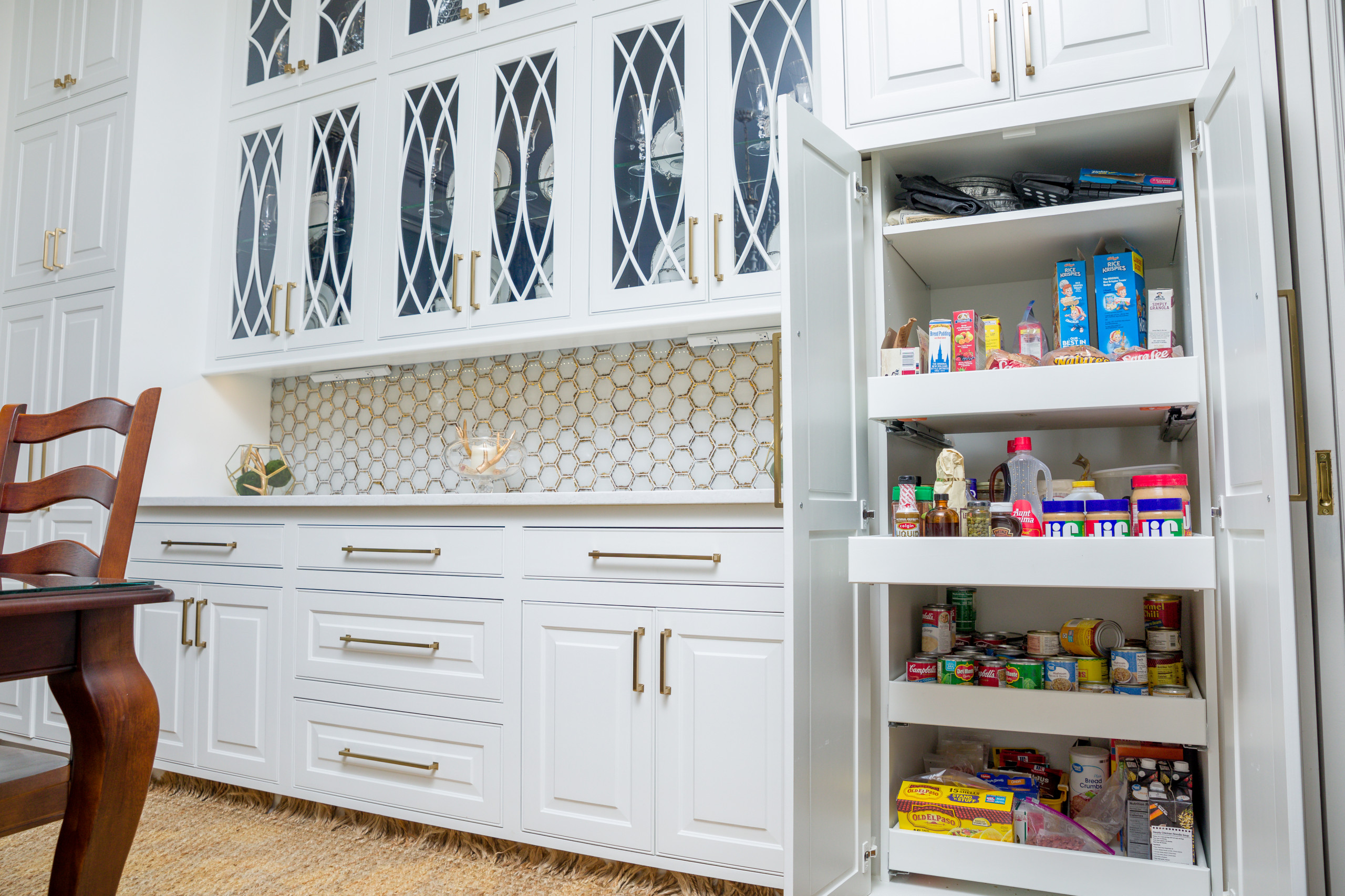
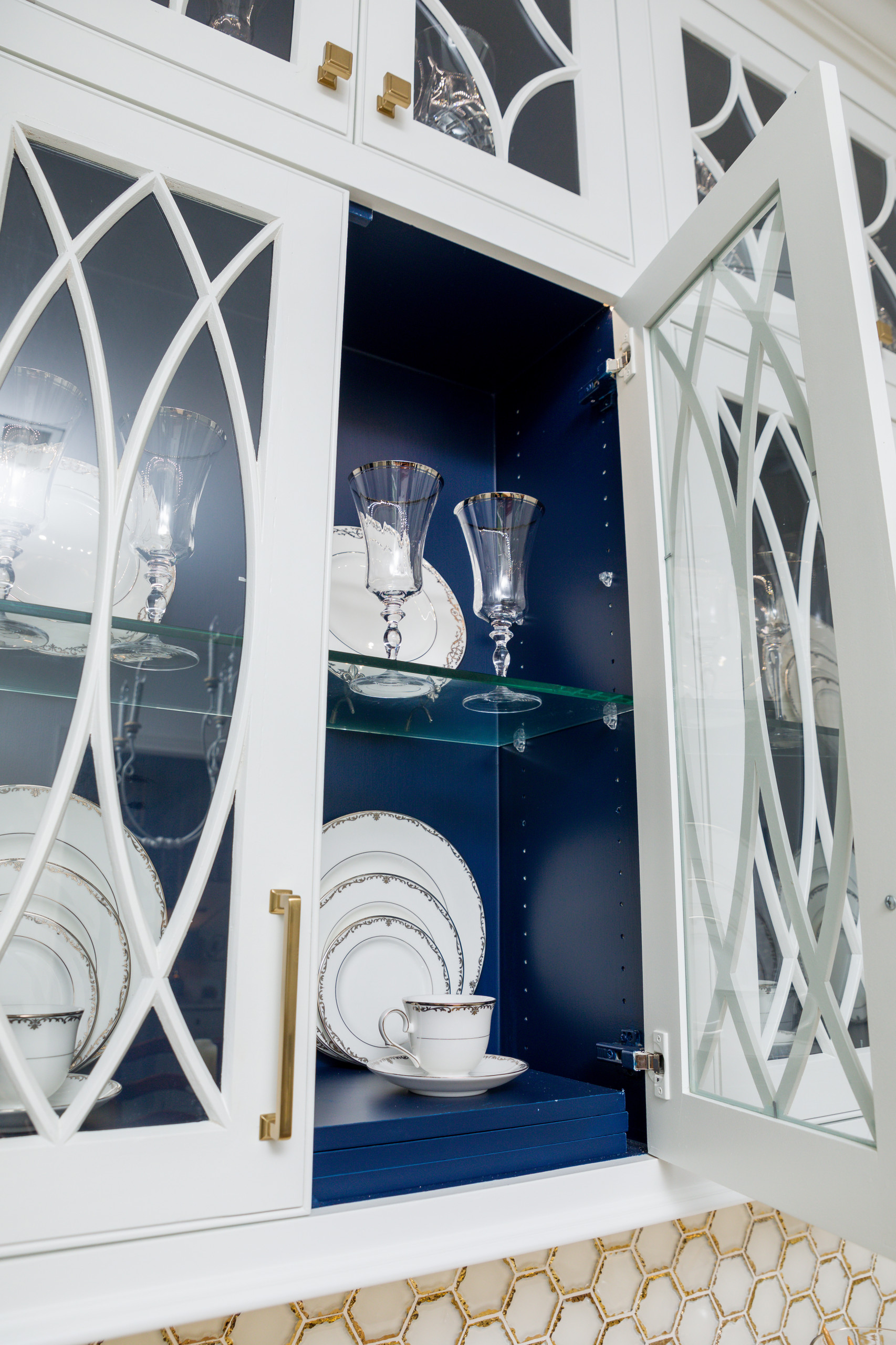
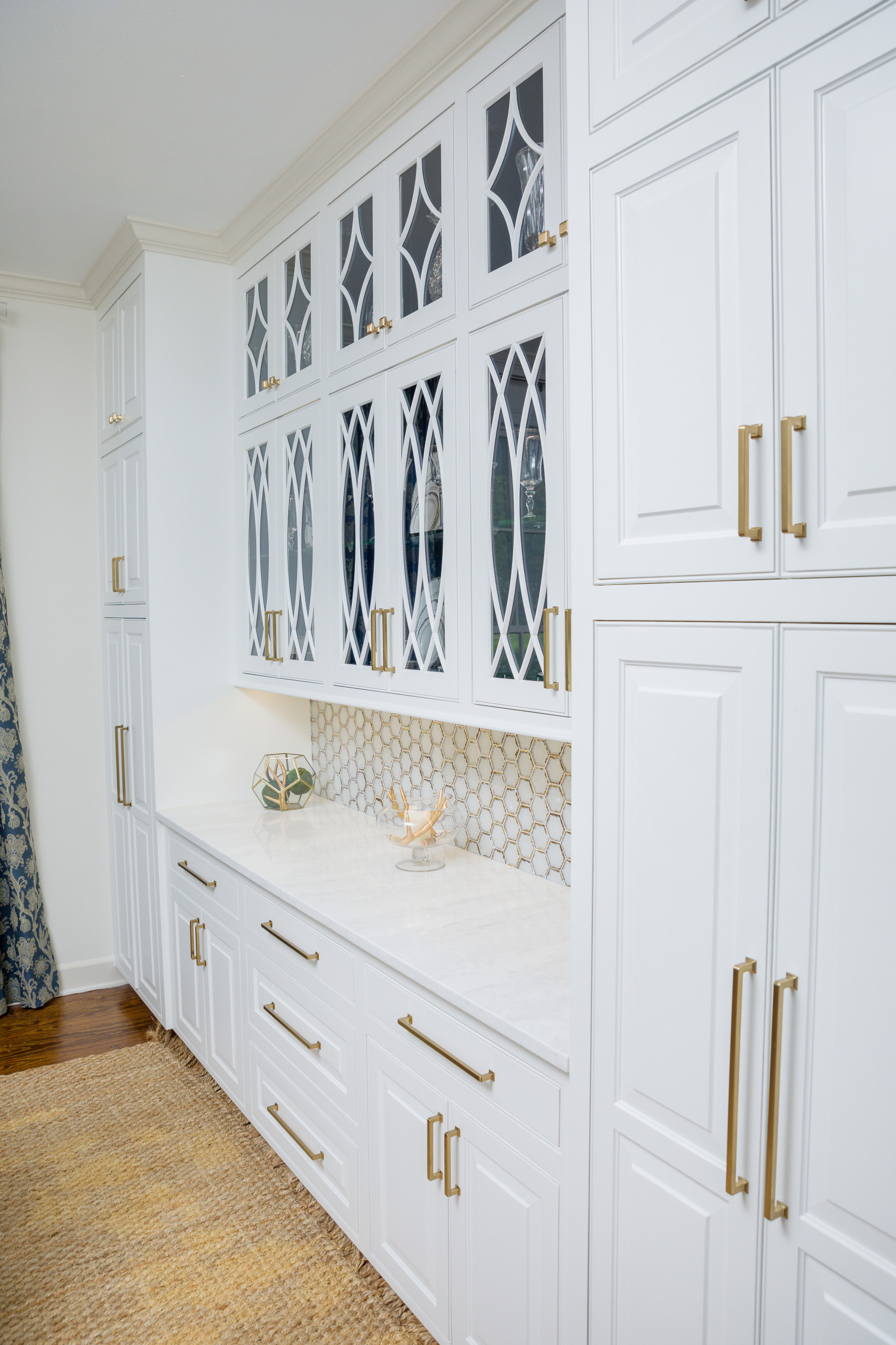
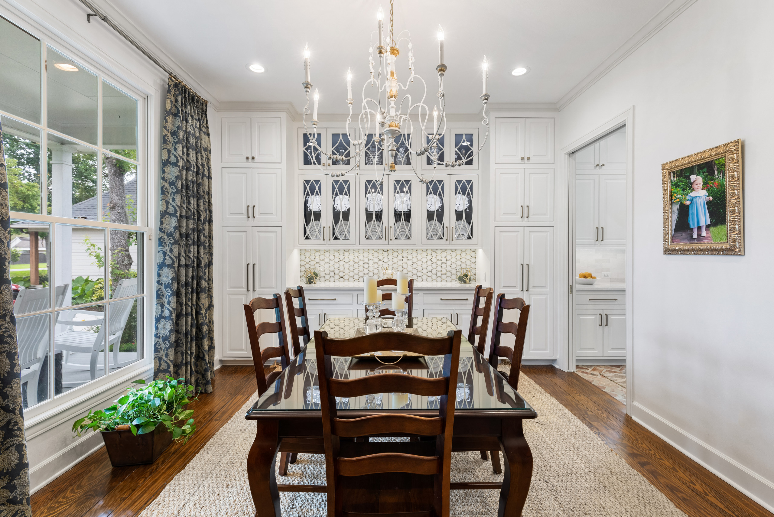
In the dining room, we designed beautiful built-ins with glass doors for china display and storage as well as a large pantry storage with pullouts. The home has beautiful ten foot ceilings, so we decided to bring all of the cabinets up to the ceiling to add even more storage.
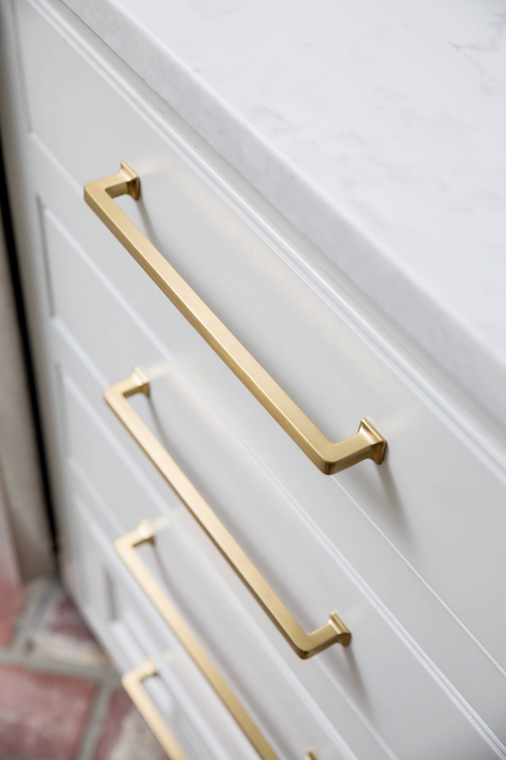
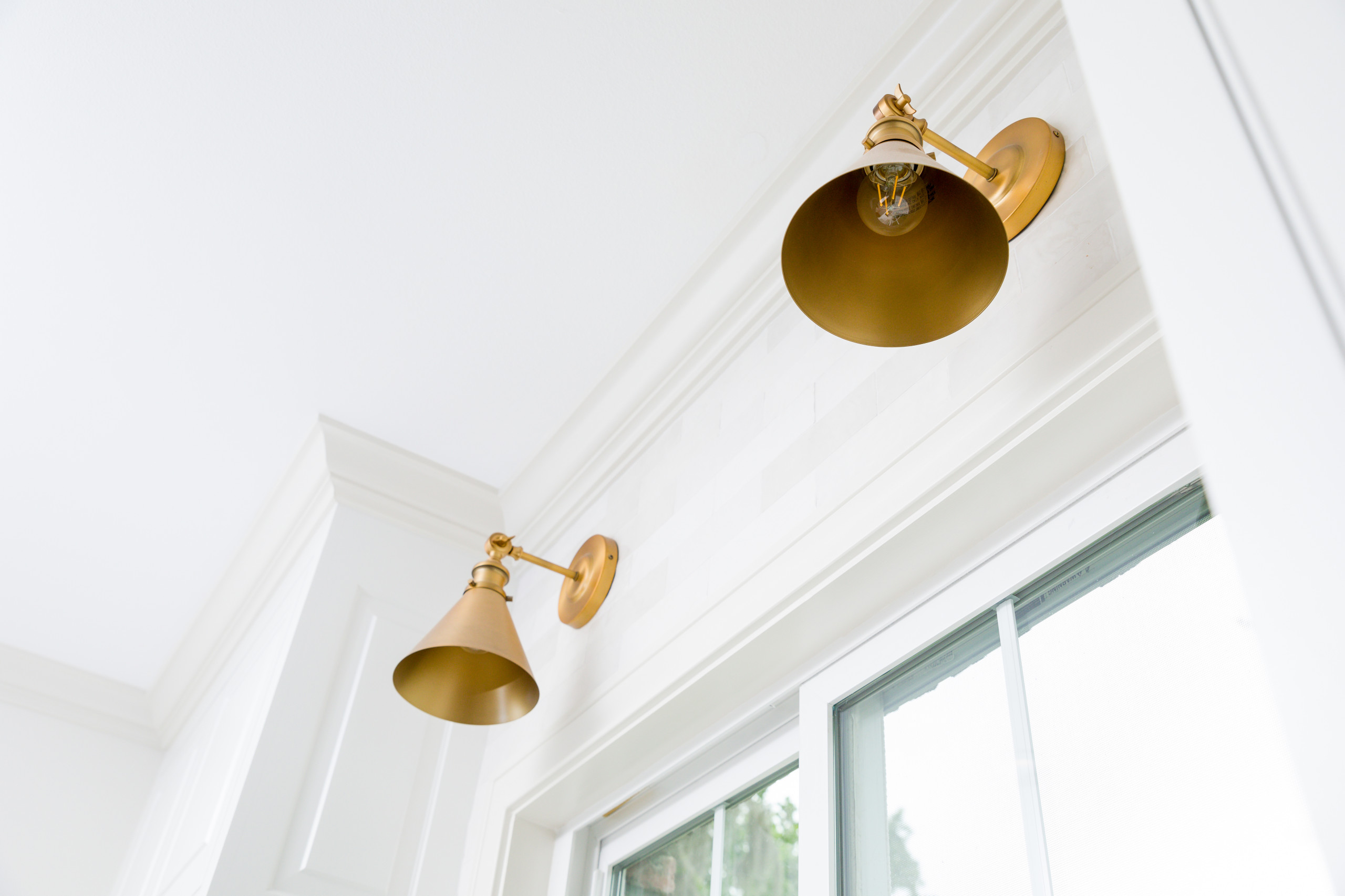
The color palette we chose for this project was mostly creamy whites with navy blue accents on the island and in the dining room. We used Pure White by Sherwin Williams for all the perimeter cabinets contrasted with In The Navy also by Sherwin Williams on the island and Luna Plena Countertops by Vicostone. We also used In The Navy on the interiors of the dining room cabinets to tie these spaces together. We chose gold hardware and light fixtures to tie everything together!
We love how the spaces turned out and were happy to be a part of giving our clients their ideal kitchen! What are your thoughts? Follow us on social media @oursodesigns and let us know what you think.
