Real Renders
We are back again with another round of Real Renders! This is our favorite series where we feature computer renderings from some of our current or recently completed projects.
Creating these renderings is the best way to help our clients better visualize what their spaces will look like once construction is complete. By entering a space's measurements and materials into our rendering program, we are able to get a photorealistic view of how a space will turn out. Without further ado, let's jump in!
Natural Tone Kitchen Design
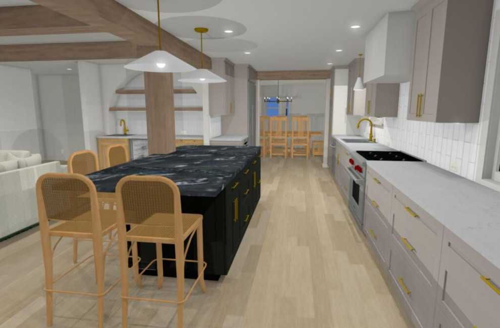
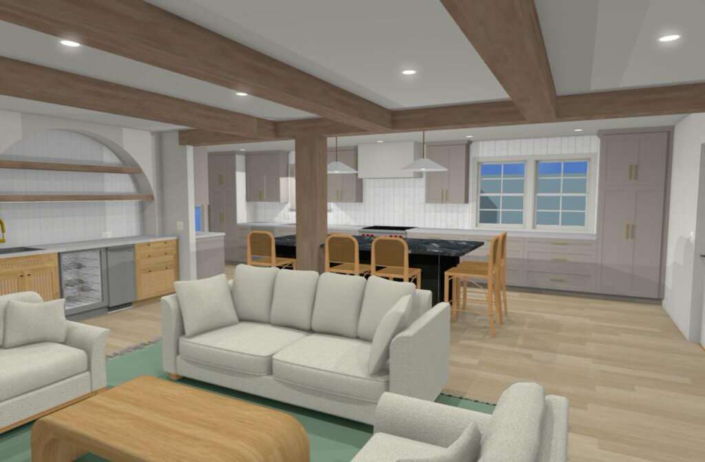
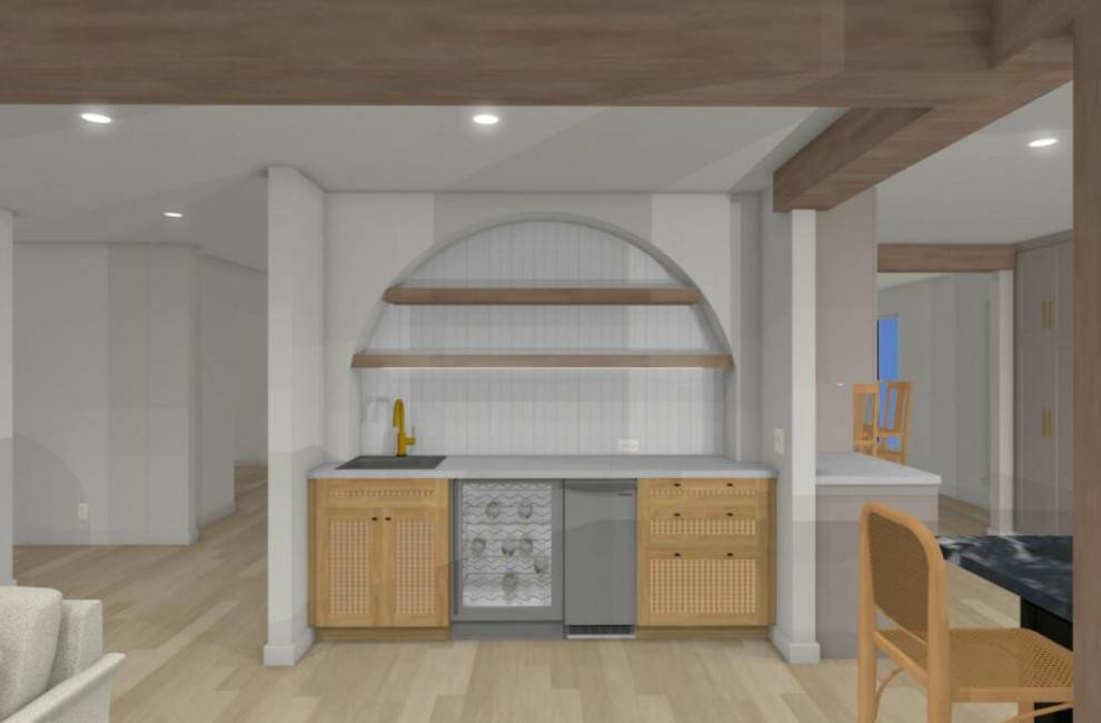
This client had a smaller galley kitchen. We took out the wall that separated the kitchen from the living space. Removing that wall allowed us to put in a large island. We also opened up the kitchen to the dining room. With the dining room being more open to the kitchen, the breakfast are became less necessary, so we extended the kitchen into the breakfast area. This added great storage to the space. There is no walk in pantry, so we had to utilize the cabinetry for good pantry storage. There was a built in area of the living room that we turned into a wet bar. The powder room shares a wall with the bar wall making it easy for us to add a sink here. We used a beam to separate the kitchen from the living room and add support for the removal of the wall, as well as some beams running perpendicular spread across the living space.
The original entry into the home was through the laundry room. We added a wall to separate the laundry and create a mud room to enter through. Overall we did a mix of shades of greens and whites, as well as wood tones. The island will be a rich dark shade of hunter green with a beautiful piece of soapstone on it. The bar cabinets will be light wood tones with rattan panels and lovely green/grey tile. The perimeter will have a creamy “mushroom” colored cabinet with a pretty light backsplash. This project is currently under construction and we are very excited to be able to compare our readers to the real thing someday soon!
Modern Home in the Woods
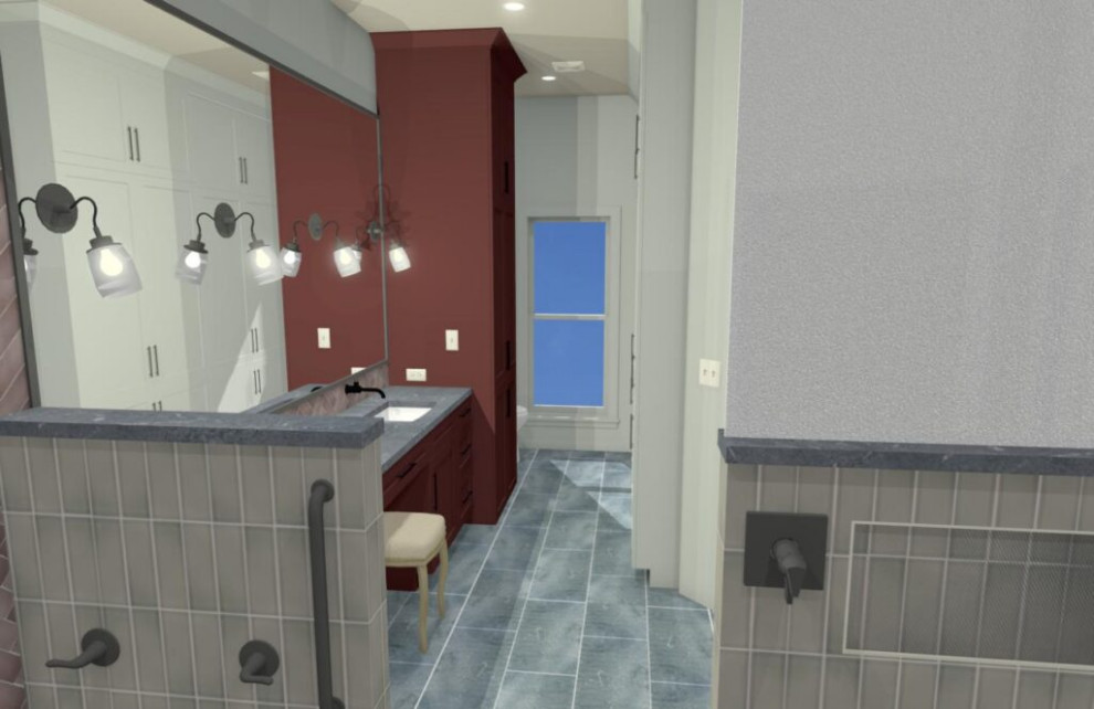
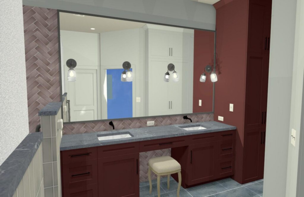
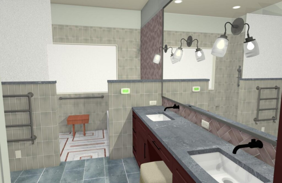
A beautiful modern home tucked away in the woods. Their original bathroom boasted beautiful bold colors and fun tiles. While the design concept was rich, the same could not be said for the floor plan. The shower and tub were too small and the layout was not efficient. There was plenty of space not being utilized. We relocate the shower closer to the tub and pushed the vanity area down to extend the cabinets for 2 sinks, a vanity, and a linen tower. The shower became much larger, and we made sure to make it curbless and a walk-in - one this makes for a great look and two it's great for aging in place. We made sure to go back with rich colors, including red, pinks, and greys. The tiles are both rich in color and texture and are arranged in a few different patterns for visual interest. You'll find show a stopping mosaic tile on the shower floor that pulls this amazing color palette together!
Brick & Blue Kitchen Upgrade
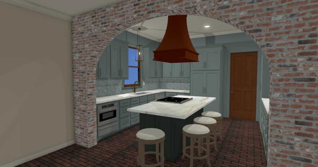
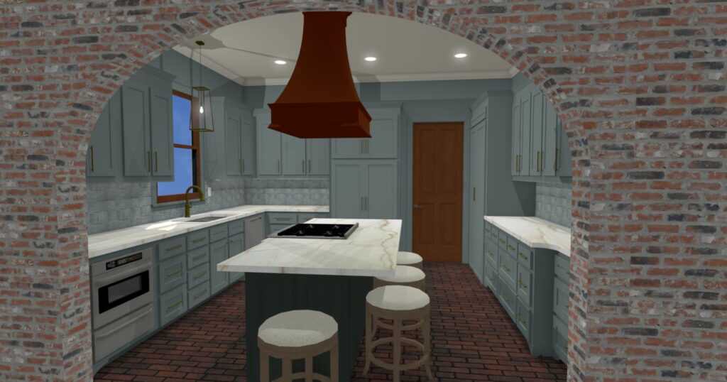
We had great bones to work with in this kitchen. The space was already there. We replaced all the cabinetry to a style that was no longer dated and painted this kitchen in a rich monochromatic blue color scheme. We tweaked the layout of the appliances for a more efficient layout as well. This included taking the range top out of island. We moved the refrigerator to another wall to make room for the range to be located on the "L" perpendicular to the sink. The range includes an oven so we no longer needed and oven stack, leaving us with more prep counter around the sink. We had beautiful original brick floors and a brick archway to work with. We finished off the color pallete with copper and gold accents and it made for an amazing finish product! Pictures COMING SOON!
We are so thrilled with how these projects are turning out! Most of these will be starting construction soon and we can't want to show everyone the final product. Interested in having us help transform your home? Give us a call at (225) 291-8589 and we can help start your process today!
